In this article
A construction company name is different from the name of a residential project. The firm may develop several projects, appear beside different partners and add new areas of work over time. Its logo should be considered a continuing signature across those changes. Before drawing the outline of one building, discuss the surfaces and neighboring names that will accompany the identity. Recognition between a long site boundary and a compact proposal heading provides a more useful evaluation than a presentation built around a single architectural image.
Quick answer
Establish a clear hierarchy between the company name, descriptor and any symbol. Give project names their own layer without allowing them to replace the corporate signature. Test the identity across a long site surface and a small document heading. Building or crane imagery is optional; assess whether the choice supports the company’s character and remains clear across the intended applications.
Choose a symbol that can travel between projects
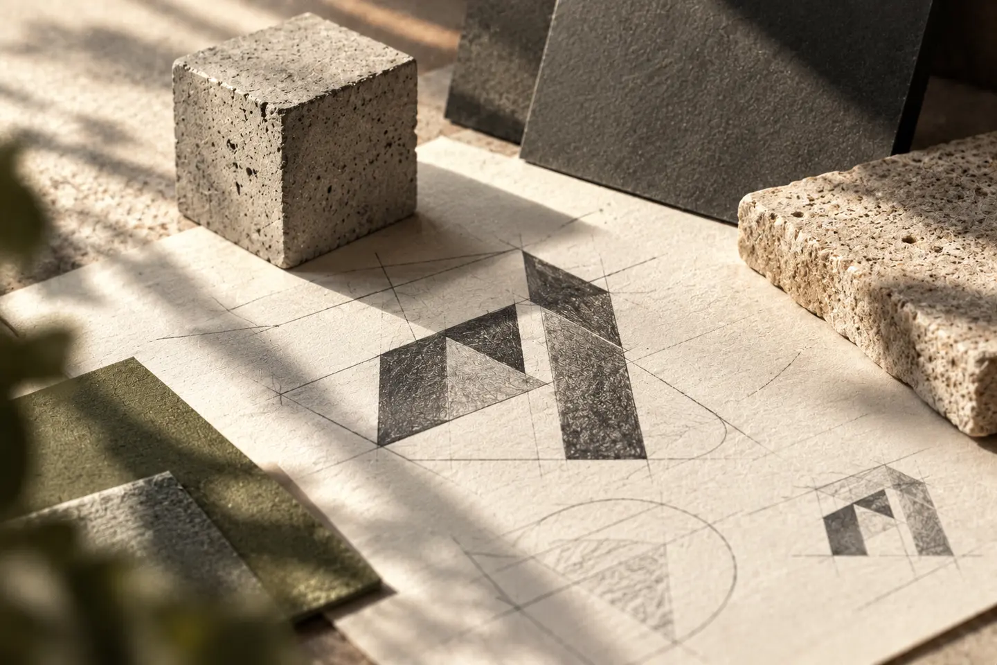
Turning one building elevation into a permanent symbol may feel meaningful for the first project while narrowing the narrative for later work. An abstract proportion, a relationship between letters or a structural rhythm could accommodate different project types. This is a design option rather than a universal rule; a firm may deliberately identify with a particular architectural approach. Explain the reasoning and show the symbol both alone and with the full name. Remove three-dimensional presentation effects to inspect whether the drawing itself maintains a balanced character across applications.
Give a long company name a reading order
When the name, construction descriptor and other business information receive equal weight, the first thing to read becomes unclear. Consider handling the full information used in documents separately from a shorter brand signature. Agree with the client which wording belongs in each application. Preserve the required language characters within the letter arrangement. Very condensed lettering can reduce width but close internal spaces. Compare one-line and two-line versions in the actual heading area, rather than choosing through an enlarged word displayed without surrounding content. The name should remain understandable within its complete layout.
Define the relationship with project identities
When a project has its own promotional name, how will the construction company appear beside it? The firm might act as a modest endorsement or occupy a more prominent shared arrangement. Compare several examples before defining that relationship instead of moving the company signature to another arbitrary position for every project. Where partners appear together, inspect relative sizes and clearances separately. The objective is to communicate different roles clearly, not make all the names resemble a single logo. The client should supply the applicable usage information for any real partner identities included in the design.
Run site-boundary and document-heading trials
Prepare the first trial at the intended proportions of a long site boundary. Consider the sequence in which a pedestrian encounters the company name, project name and contact line. For the second, print a small proposal cover or document heading and check whether the symbol and descriptor remain distinct. A vehicle door example can add another useful constraint, with seams and windows kept visible. These are visual identity evaluations; required notices and specialist technical information should be supplied separately by the client. Keep that content present when it affects the available design area.
A hypothetical signature for two project types
Imagine a firm developing both a small residential project and a commercial building. One direction could rely on a strong name arrangement; another could pair the name with an abstract symbol. Compare both using identical project names, boundary layouts and proposal covers. Do not base the decision solely on the largest sign. Record acceptance criteria covering discoverable company naming, separation from the project title, open spaces in a compact heading and a clearance arrangement that accommodates partners. The comparison then concerns a signature capable of appearing across different work rather than one attractive isolated mockup.
Key takeaways
- Evaluate the continuing corporate identity beyond one project silhouette.
- Establish a clear priority between project naming and company endorsement.
- Compare the long boundary surface with a compact document heading.
Frequently asked questions
Must a construction logo depict a building?
No. A building symbol is one option; lettering or an abstract relationship may also provide a useful signature. Evaluate the choice through the firm’s intended character and application trials.
Should the company logo change for every project?
The corporate signature can remain fixed while project names occupy another arrangement. If a project receives its own identity, define where and how the parent company appears.
Does a mockup approve a physical site installation?
A mockup supports visual comparison. The client and installer should separately provide and assess the technical information and applicable requirements involved in the actual installation.