In this article
Bungalow photography already gives the roof a prominent role. Repeating that roof literally in the logo can reduce the space available for a distinctive name. The more useful subject is the character of the stay: a quiet opening in woodland, independent cabins or a shared gathering place. The mark must remain recognisable over photography and as a single-colour application on timber. Evaluate those encounters before choosing the most attractive imaginary landscape in a presentation.
Quick answer
Build a bungalow accommodation logo around a clear name and one spatial relationship. Choose between roof, tree and opening ideas instead of stacking them. Examine timber reproduction, photographic contrast and compact profile cropping separately. A door-plaque trial and a phone-layout trial show whether one visual character survives both physical arrival and digital discovery.
Draw the relationship between buildings
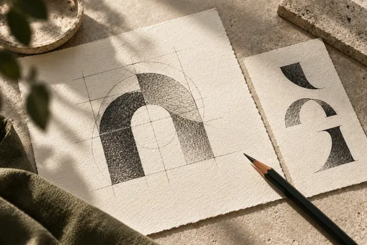
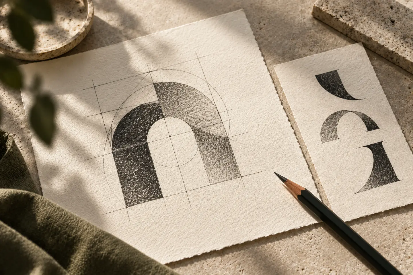
Two separated masses, a clearing or a raised base can suggest accommodation without depicting a complete house. If a triangular roof remains the chosen idea, it need not contain a forest silhouette. Empty space can carry the natural setting more quietly. Discuss whether the symbol resembles a mountain lodge, property business or campsite when paired with its name and descriptor. The goal is a useful emphasis, not the elimination of every possible secondary association.
Keep natural lettering clean
Distressed edges may suggest timber, but they can look dirty at small digital sizes. A clean letter structure with a few particular cuts offers greater control. Align the rhythm of round and angular letters with the symbol rather than selecting a rustic typeface by habit. Keep the accommodation descriptor subordinate. Turning dots or accents into leaves and birds deserves special scrutiny, because decorative substitutions can make the name harder to read in compact applications.
Question the automatic green palette
Dark green is an option, not the identity’s entire source of distinction. It will appear differently against raw timber, a painted panel and a bright screen. Examine whether it merges with trees in booking photographs. A controlled flat area behind the logo may serve recognition better than repeated recolouring. Place texture in supporting backgrounds when necessary; forcing grain into the actual letter shapes makes the small mark carry too much visual information.
Test a door plaque and a photographic card
First, place the symbol and cabin number on an 80-millimetre-wide door plaque. Inspect a real surface sample alongside any polished timber mockup. Second, arrange the logo, bungalow photograph and booking heading on a 360-pixel-wide phone card. These suggested dimensions should follow the intended product. Check that roof details do not merge with the photograph and that the cabin number cannot be mistaken for a brand initial. Record any simplification required by each environment.
Try a hypothetical woodland-clearing brief
Imagine independent wooden cabins seeking a quiet pause rather than an adventure identity. A space between two vertical forms becomes the main motif, supported by open, clean lettering. Accept it when the opening survives on timber, the name separates from photography and cabin numbers remain independent. Detailed branches can belong to larger illustrations instead. This fictional exercise distributes the visual work between logo, photography and pattern, so that the mark itself can remain compact and stable.
Key takeaways
- Choose the character of the stay before a building icon.
- Keep timber texture outside the core letter shapes.
- Check the symbol beside actual cabin numbering.
Frequently asked questions
Must triangular roofs be avoided?
No. Their proportions, negative space and relationship to the name should carry a particular decision. A standard roof outline may communicate the category without identifying the individual business.
Is a separate carving version necessary?
Evaluate a sample with the producer. A version with more open spaces may be useful, provided its relationship to the main mark and intended applications are clearly defined.
Can the logo sit on any photograph?
Different photographs provide different contrast. Light and dark versions plus a controlled background option keep recognition from depending entirely on finding a conveniently empty part of every image.