In this article
A building inspection company can express attention and method without making its identity look like an official seal or an approval certificate. The logo’s role is to identify the firm clearly. Reports, checklists and site documents already carry information with specific meanings, so the signature should not take over their role. A readable name and an independent corporate voice provide a broader starting point than a large check mark presented as the entire identity.
Quick answer
A building inspection logo can use measured geometry and clear lettering to suggest an organised practice. Keep the symbol distinct from approval graphics and report results. Evaluate recognition on a document cover, a small identity card and a monochrome print. The logo identifies an organisation; it should not appear to certify the technical content beside it.
Explore attention without relying on a check mark
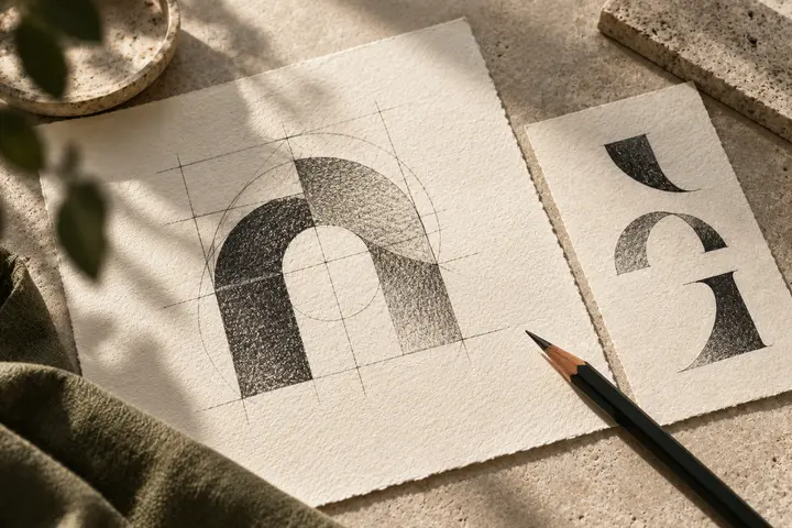
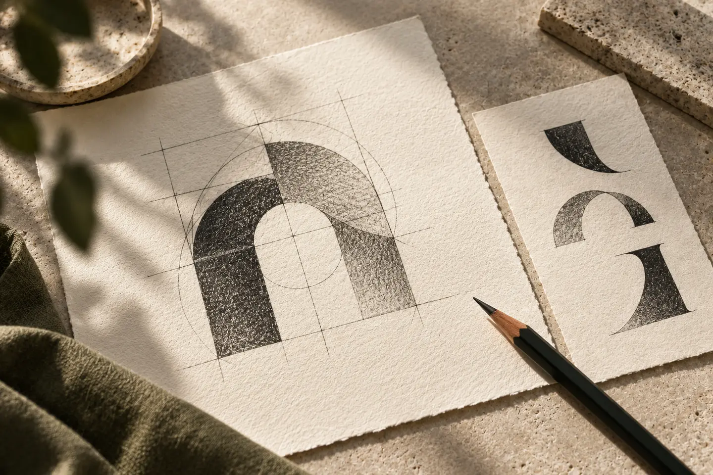
One line framing another, balanced planes or an open corner can suggest method and attention. If considering a tick, examine whether its repeated presence could imply that every document has already been approved. A heavy ring enclosing tiny lettering can resemble a seal even when that was not intended. A simpler open sign beside a prominent company name identifies ownership more directly. Avoid complicated geometry that depends on a lengthy explanation to recover its intended meaning. Start by observing what the mark communicates without narration.
Distinguish company name from report title
Allow the document subject to occupy its own space beside the signature. A condensed typeface may fit many words but lose its counters in a small office photocopy. Moderate weight and measured spacing offer a more robust starting point. If one word is large while the remaining company name becomes tiny, viewers may identify the firm incorrectly. When initials are used, establish where the full name appears and test that relationship on an actual report layout rather than in an isolated brand presentation.
Choose colour without implying status
Deep blue, green or charcoal are possible choices, not evidence of neutrality or competence. Compare contrast on paper, visibility on workwear and the monochrome equivalent. A red identity accent may conflict with warnings within report content; give the brand and document status codes different roles. Reverse lettering may need optical adjustment to match the apparent weight of its dark counterpart. Review the two versions together instead of relying on the reassuring brightness or polished appearance of a screen mockup.
Print a cover and a compact identity card
Place a 35-millimetre-wide signature on an A4 report cover with a long project name and date. Print it in greyscale and read it from normal desk distance. Separately, make an 85 by 54-millimetre hypothetical staff card containing an 18-millimetre symbol, company name, photograph and person’s name. These are design trial dimensions. Revise if the logo overwhelms personal information, becomes a dark spot or competes equally with the report title. Both objects should identify the firm while allowing their primary information to remain useful.
Define acceptance for a hypothetical firm
Imagine a company seeking one identity across documents for varied building projects. The brief asks for a clear name and a calm framing idea, without imitating a certificate or seal. Compare a colour cover, greyscale print and staff card. Acceptance requires accurate name reading, separation from report results and a stable relationship with changing document details. Use the company-approved title. Visual review cannot determine institutional status, regulatory compliance or technical authority; any necessary statements about those subjects must come from the responsible content specialist.
Key takeaways
- Keep company identification separate from document approval.
- Give report titles, company names and personal details distinct levels.
- Complete colour review with monochrome and compact-card trials.
Frequently asked questions
Can a shield work?
Possibly, but assess whether it suggests an unsupported protection or authority claim. Clear lettering may identify the firm more directly.
Does the identity need an official appearance?
A serious, ordered tone does not require imitation of a public authority or document seal.
Can a tick appear on every page?
Repeated ticks may blur the distinction between identity and report outcome. Review their context with the content owner.