In this article
An aviation company is not necessarily an airline. Maintenance, services and other corporate activities can create different identity needs within the same sector. A plane silhouette is therefore not always the most useful starting point. Review the customer-approved activity description, intended surfaces and name length first. The mark identifies the company; it does not prove the quality or safety of an operation. Consistent reading across a card, information folder and screen provides a more concrete visual design objective for the brief.
Quick answer
A sense of direction or lift can come from a relationship between letters rather than a literal aircraft. If wings are used, reduce feather-like lines and other small details. Compare a 28-millimetre visitor-card impression with a 210-pixel presentation header to assess name hierarchy and the symbol’s behaviour in one colour.
Separate an aviation association from a plane picture
An aircraft silhouette creates an association, but its fit with the actual business needs discussion. An open arc, two balanced wing-like surfaces or a directional relationship inside an upright letter offer alternatives. An arrow pointing skywards is not compulsory. Slanting every line forward can make the mark unstable. First assess the symbol as a still, flat-colour form. When direction can be suggested without consuming all the surrounding space, the identity is easier to carry across different corporate communication materials.
Consider the movement introduced by slanted lettering
Italic or inclined letters can convey motion, but they may complicate the reading rhythm of a long name. An upright wordmark can provide a deliberate balance beside a more dynamic symbol. Inspect letter width on a narrow card. The aviation descriptor can sit at a different level rather than matching the company name in size. Turkish accents should remain complete within any slant. Watch for accidental joins when a letter tail touches a symbol stroke; printed samples often reveal these relationships more clearly than enlarged drawings.
Look beyond an automatic sky-blue palette
Blue is available without being a condition of an aviation identity. Choose colour alongside the corporate tone, document surfaces and surrounding photography. A white logo placed over a pale sky may not separate sufficiently from the image. Compare a reserved photographic area with a plain background strip. A dark monochrome mark should work independently of the colourful presentation cover. Shine and speed trails can appear in supporting graphics if useful, but recognition of the main identity should not depend on these effects.
Proof a visitor card and presentation heading
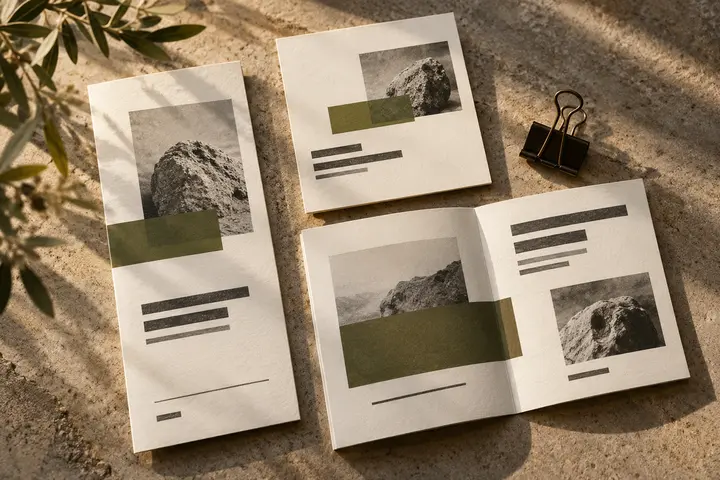
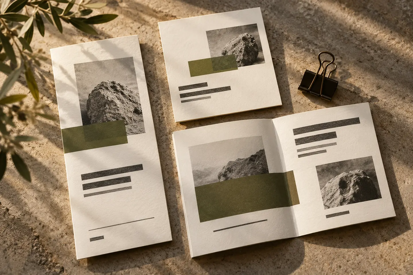
The first sample is a visitor card with a logo 28 millimetres wide. Add fictional person and role information to create a realistic amount of surrounding text. The second is a digital presentation header with a 210-pixel-wide logo, reviewed on both a photographic slide and a plain one. Open spaces should remain visible on the card, while the name should not merge with photographic lines on screen. Both arrangements should remain recognisable in one colour. Complete this normal-scale review before selecting through enlarged details.
A hypothetical aviation services brief
The hypothetical brief concerns a company presenting corporate aviation services. Explore an open arc derived from a letter rather than an aircraft illustration. The visitor card uses a compact lockup, while the information folder includes the full company name and customer-approved description. In the final review, the card, folder cover and presentation should identify the same organisation. The symbol should remain distinctive without unnecessary motion trails. The design decision introduces no new claim about flight performance, certification or operational assurance; those matters are outside the logo’s visual role.
Key takeaways
- Define the approved activity scope before selecting an aircraft silhouette.
- Compare a dynamic symbol with a quieter typographic arrangement.
- Inspect photographic applications at their ordinary screen dimensions.
Frequently asked questions
Does every aviation logo need wings?
No. Wings can introduce a sector association, but a distinctive letter or open geometric form can also work. The choice should not unnecessarily narrow the perceived activity of the business.
Does slanted type look faster?
It can imply movement, without necessarily being easier to read. Compare upright and inclined arrangements at identical actual sizes, particularly when the company has a long name.
Can the logo sit directly on photography?
Yes, although not every image provides a suitable area. Prepare light, dark and plain-background options so the name remains clear as the photography changes.