In this article
An architecture studio logo often works at the edge of someone else’s visual story. Plans, sections and photographs explain the project; the studio signature identifies who shaped it. Trying to compress the entire architectural approach into a building illustration can overload that role. Letter proportions, punctuation and controlled space may communicate a considered practice more effectively. Quietness still needs presence: the name should remain identifiable in the corner of a drawing.
Quick answer
An architecture studio logo should act as a recognisable signature without competing with the work. Begin with the name and its spacing; add a symbol only if it has an independent purpose. Test actual lettering on drawing titles, portfolio covers and narrow spines, checking that fine strokes survive print and that partner names retain their intended hierarchy.
Separate brand lines from drawing lines
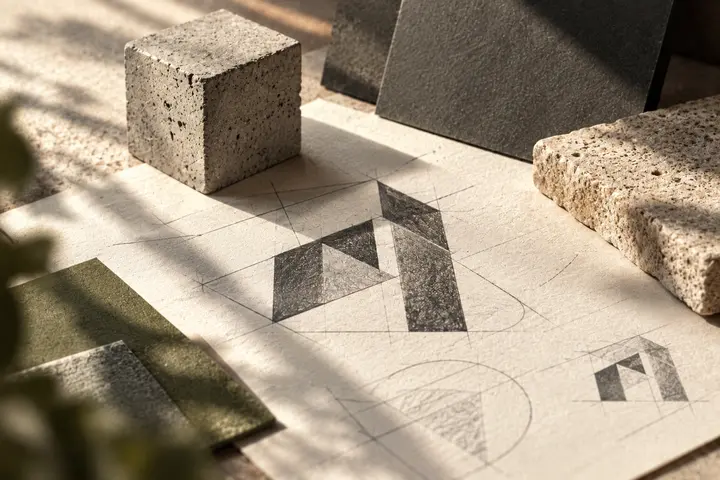
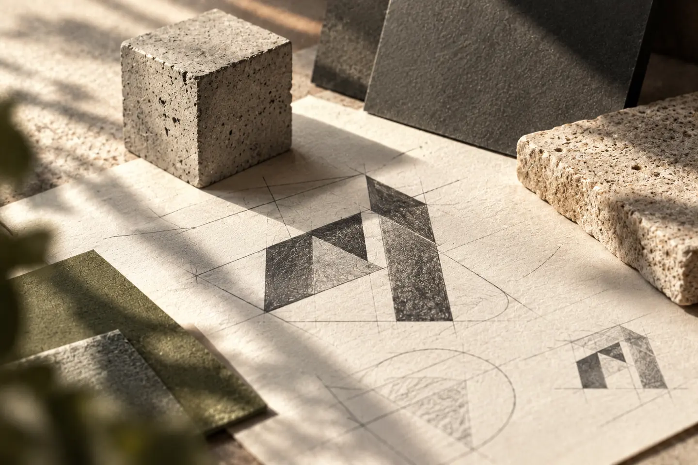
A grid can support design development without appearing in the finished mark. If internal logo lines merge with drawing axes, the signature loses its boundary. Explore solid and empty masses first, then position the proposal beside dense hatching. A logo that works only on an empty white page may struggle in daily presentation material. Its construction can suggest disciplined thinking without looking like an extract from a technical detail. Evaluate silhouette before asking viewers to interpret a design explanation.
Set names through their actual letterforms
Combined partner surnames and short studio names need different rhythms. Numerically equal gaps may not create visual balance between curved and straight letters. If punctuation appears between names, check that a slash, plus sign or dot does not become the dominant feature. A secondary architecture descriptor should fit the title block without forcing excessive height. A delicate typeface may look elegant on screen but still need reconsideration after an ordinary office printout. Use the full names throughout these comparisons.
Let colour support the portfolio
Black and white can keep attention on projects, while one accent may organise section dividers or digital navigation. Continually recolouring the logo to match architectural photography can make one portfolio appear to contain several unrelated studios. Give a reversed white signature sufficient surrounding space. Fine grey strokes may feel restrained on screen yet become weak on a printed cover. Keep a convincing dark version available and judge the palette alongside both warm interior imagery and cool exterior photography.
Print a title block and build a spine
Print an A3 drawing at actual size with the logo 22 millimetres wide in its title block. Check its lettering beside the date, scale and project title. Separately, build an 18-millimetre-wide portfolio spine and place it on a shelf. Review reading direction, edge clearances and the behaviour of the symbol in that narrow space. These example dimensions should be replaced by the studio’s actual formats. Inspect the physical pieces from ordinary use distances, rather than relying on enlarged photographs of them.
Review a hypothetical two-partner studio
Imagine two partners producing competition entries and smaller conversion projects. Their brief calls for precision without theatricality, with neither surname dominating. Compare three directions on the same cover, title block and spine. Acceptance should require readable names on a modest office print, a line weight distinct from drawing detail and a stable order of reading. Record where the preferred proposal struggles as carefully as where it looks convincing. This makes the decision more useful than choosing the most impressive single portfolio mockup.
Key takeaways
- Separate logo strokes from the visual language of drawing detail.
- Balance partner names optically using their actual letters.
- Treat a portfolio spine as a separate reading problem.
Frequently asked questions
Can the logo use very fine lines?
Yes, if continuity survives the smallest intended print. Recognition should not depend on a detail that disappears.
Must a construction grid remain visible?
No. The grid is a working tool; coherent proportions can communicate its discipline without exposing it.
What happens when partner names change?
Explore how the name arrangement expands or contracts early. This makes the visual consequences of a future change easier to understand.