In this article
A sport or fitness identity extends beyond an energetic logo or a large mark on a wall. People encounter it while searching for programme information, reading membership details, finding their way around a venue and asking a staff member for assistance. A gym, individual trainer and sports product brand also have different application requirements. This guide focuses on connecting service and venue communication to identity design. It does not provide training or health advice, or promise performance outcomes; its concern is clear presentation of approved business information.
Quick answer
Sport and fitness identity should connect the name, service explanations, venue guidance, team clothing and digital announcements through a coherent visual system. Impressions of strength or movement should not replace readability. Test the design on large physical applications and small membership cards. Keep promotional language aligned with the actual service scope instead of allowing energetic imagery to introduce unsupported expectations.
Clarify the service structure represented by the brand
A venue, independent trainer and product collection create different relationships. List which services the name represents. Separate class names, programmes and temporary events from the permanent logo rather than appending each one to it. Consider how a later service joins the system. Do not select the direction solely through abstract ideas such as strength or speed; whether someone can understand the business and its actual offer is also a useful criterion for evaluating creative alternatives.
Distinguish atmosphere from practical wayfinding
A large wall treatment can establish atmosphere, while locating reception, an entrance or another area performs a different function. Not every sign needs the same decorative approach. Review position, viewing direction and reading conditions in the actual space. Do not assume colour or a symbol communicates every required instruction; descriptive text may also be needed. An impressive interior photograph does not independently show that a first-time visitor can find the place they need.
Test the mark on clothing and compact cards
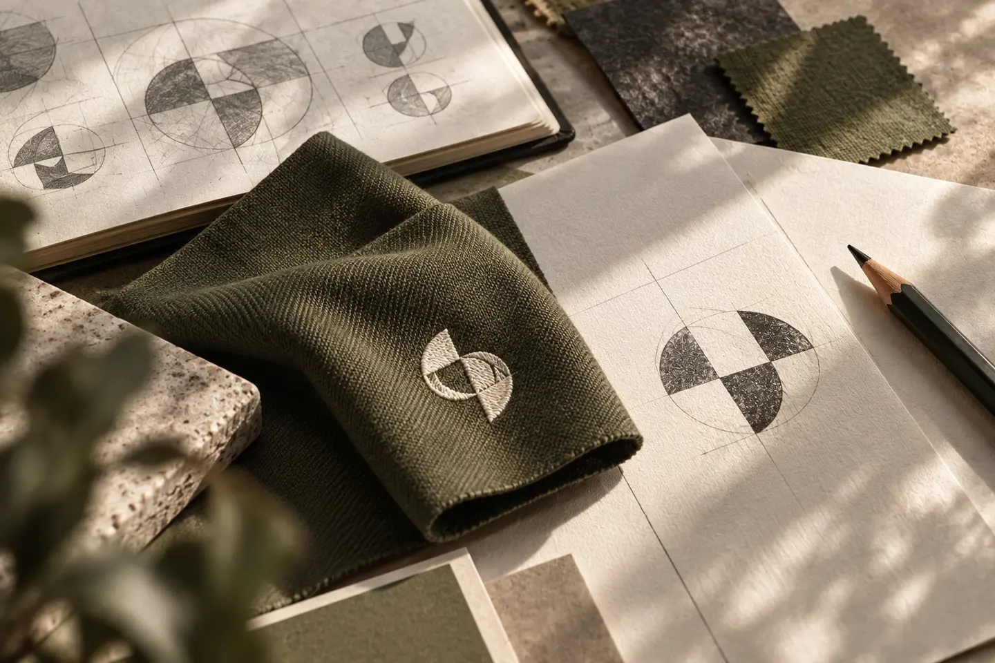
Staff clothing may involve embroidery, printing or another method. Once the process and material are known, request a suitable supplier sample. Review fine lines and internal spaces. A membership card also needs room for names, codes or other approved information. A beautifully printed logo does not resolve functional text squeezed into an unusable corner. Instead of forcing one minimum measurement onto every surface, document accepted examples showing the relevant dimensions and production approach.
A hypothetical brief for a venue with changing programmes
Imagine a fitness business advertising seasonal programmes under one permanent brand. The identity scope includes the logo, wayfinding examples, staff clothing, timetable, membership information document and social templates. The brief includes long programme names, changing times and a possible second language. The business provides programme content; design organises how people understand it. This is a hypothetical working exercise rather than a real BOCW customer story or a claim about the results of any service.
Align campaign language with membership information
Attention-grabbing graphics do not compensate for unclear membership scope. Use approved descriptions and any relevant dates or temporary conditions consistently across the materials. Avoid unsupported claims about bodies, health or performance. Names in a social announcement should mean the same thing on the registration page and information document. Evaluate whether people can identify the intended programme and application route as well as whether the post feels energetic during a presentation or appears attractive in a profile.
Plan ongoing programme updates in the BOCW handover
Share the business type, venue photographs, intended surfaces and existing communication. Identify permanent identity elements and regularly changing information. Prepare templates the person updating timetables can actually use. Separate current files from past campaigns and experiments. Each announcement need not recreate a visual language from scratch. At acceptance, review actual examples of the clothing, venue, membership document and digital page together to assess whether they communicate the same understandable brand across different practical situations.
Key takeaways
- Separate the permanent service identity from changing programmes.
- Do not treat decorative venue graphics as a substitute for wayfinding.
- Review promotional wording against actual membership details and registration routes.
Frequently asked questions
Must a fitness logo use heavy or slanted lettering?
No. That is one visual option. Intended users, the service structure and reading conditions should inform the decision.
Does every programme need its own logo?
Not necessarily. A structured naming and template arrangement may preserve recognition of the main brand more clearly.
Does this identity work provide training or health advice?
No. Its scope is visual and verbal communication. Service content and relevant explanations must come from the responsible business specialists.