In this article
Logistics logo design is not completed by drawing an arrow that suggests movement. The mark needs to be recognised on a vehicle at a glance, identify the business at a warehouse entrance and leave room for information on a dispatch screen. Vehicle panels and everyday operational documents impose different requirements. Reviewing fleet photographs, site signage and digital interfaces together makes a better starting point. The identity should make the business visible while keeping addresses, gate numbers and task information easy to understand.
Quick answer
A logistics logo should support quick recognition on fleets and facilities without overwhelming operational information on documents or screens. Test vehicle panels, small labels and warehouse entrances together. Separate brand identity from directional signage, and confirm surface and film choices with the production partner. A symbol that suggests speed alone does not create a usable logistics identity.
Make the fleet inventory part of the design brief
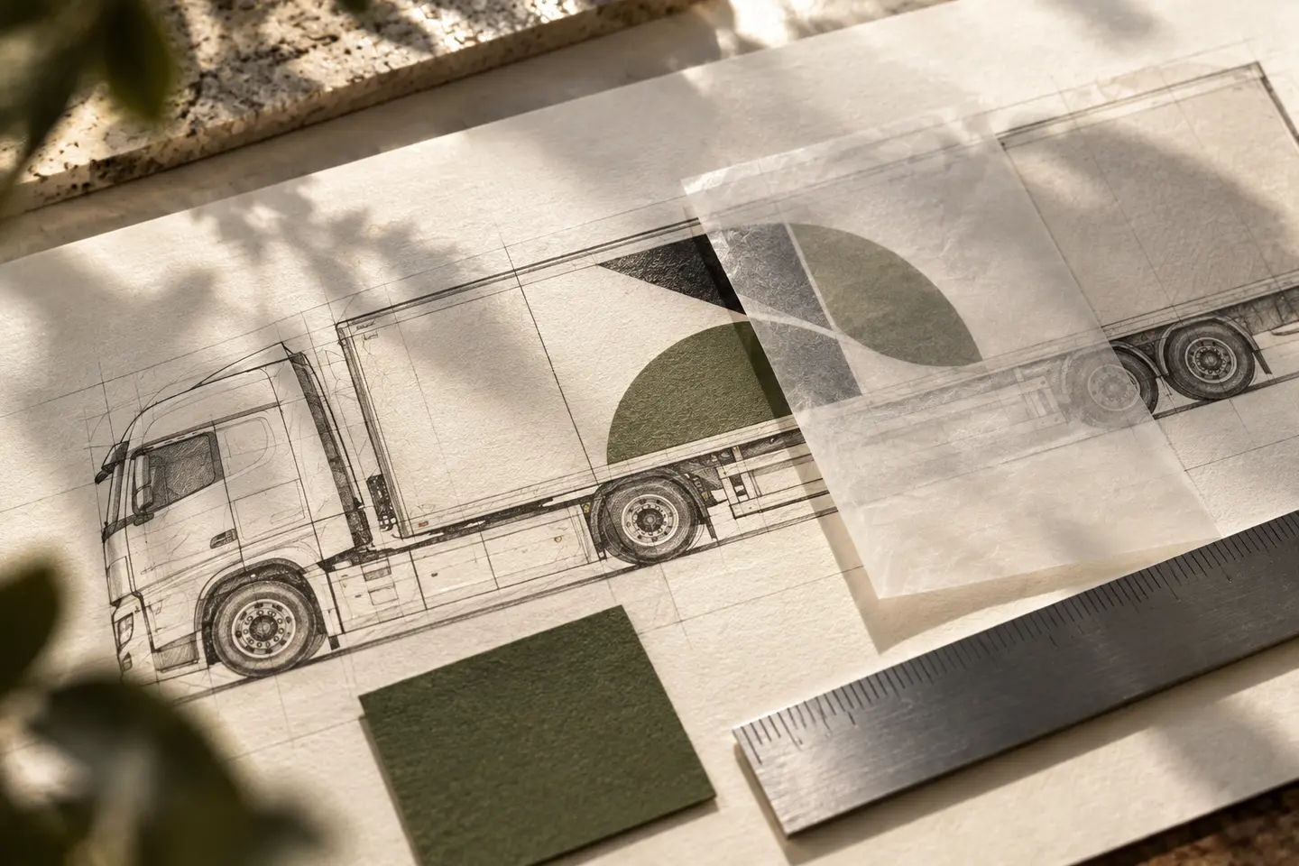
Trailers, panel vans and site vehicles may not support the same layout. List the vehicle types actually used, their existing body colours and the surfaces intended for graphics. Request front, side and rear photographs. Check early drafts for seams, handles and panels that interrupt important letters. Define a shared alignment and spacing logic instead of forcing identical dimensions onto every vehicle. This lets a varied fleet appear related while accommodating the shape of each body.
The name first, supporting information second
Giving every message on a vehicle equal size can make the whole graphic difficult to read. Establish a hierarchy for the main mark, service description and contact details. Assess different viewing distances without assuming that long text will be readable from a moving vehicle. A nearby delivery van and a distant trailer may need different amounts of detail. Verify any web address or telephone number. If an arrow forms part of the mark, keep it distinct from actual directional information.
Treat recesses and curves as production considerations
A wrap mockup should not treat a vehicle body as a flat poster. A 3M application bulletin for specified wrap films explains that different recesses and application methods create different stresses in the graphic. For design, this means reviewing placement with the installer and making material decisions beyond colour. Keep essential letters away from complex surfaces where possible. The quotation should identify film selection, surface preparation, proofs and installation responsibilities. Record the approved layout alongside the vehicle type and chosen material.
Distinguish the business from the route through its site
An entrance sign identifies the company; gate numbers, loading areas and visitor directions describe a task. The logo does not need to be the largest element on every directional panel. Plan codes, arrows and area names in a system that can be updated. Operational and safety signage should retain the arrangements approved by the relevant teams. Pair area colours with written names or numbers. Observing what visitors look for first on site gives design decisions a practical basis.
A hypothetical distribution-centre brief
Imagine a business with several vehicle sizes and one distribution centre. Its brief separates recognition on the fleet from helping arriving drivers locate the correct entrance. The design presentation shows a trailer side, van door, visitor sign and dispatch-panel header. A large name serves the vehicle, a clear entrance label serves the facility and a compact brand area serves the screen. Review whether arriving drivers can distinguish entrances, visitors can identify the business and staff can find the information they need on the screen.
Prepare guidelines for the next vehicle
When the fleet expands, use approved layouts rather than recreating graphics from memory. Record the vehicle model, surface, artwork version and approval date together. Include small-screen and single-colour document versions in the logo package. Guidelines should also explain how to assess a new vehicle: collect photographs, check panels, adapt the arrangement and approve a proof. Compare quotations by separating logo design, adaptations per vehicle, warehouse signage and physical installation. Future changes then have a clearer place in the project scope.
Key takeaways
- Check panel seams early for each principal vehicle type.
- Give gate and area information its own wayfinding hierarchy.
- Separate design, adaptation, material selection and installation responsibilities.
Frequently asked questions
Does a logistics logo have to contain an arrow?
No. An arrow can express movement or connection, but it should not be confused with a warehouse direction. Distinctive lettering or another original symbol may work equally well. Recognition tests on actual vehicle layouts provide more concrete selection criteria.
Can one vehicle mockup represent the whole fleet?
It may not represent a fleet with different bodies and panel structures. Review layouts for the principal vehicle types, especially where names meet seams, handles or curves. Ask whether adaptations for additional models are included in the quotation.
Is warehouse wayfinding included in logo design?
It should not be assumed to be included. The logo establishes the identity, while gate systems, area names and sign layouts can require separate design and production work. List them in the brief and specify the files, dimensions and coordination included in the handover.