In this article
For a fertiliser company, commissioning a logo begins by separating corporate identity from product information. One brand may cover several ranges supplied in sacks, containers or other formats. The identity remains consistent while product names and client-approved descriptions change. Give the designer packaging examples, dealer material and a naming list alongside the existing mark. These items reveal which space belongs to the company and which space needs to remain available for individual products.
Quick answer
Define the hierarchy of company, range and product names before commissioning a fertiliser logo. Test the smallest container alongside a filled sack and check dealer sheets with real product descriptions. Compare proposals through packaging-family layouts, single-colour applications and rules for adding products. Obtain technical wording from the company's approved information rather than asking the identity design to create it.
Keep company identity separate from product codes
The brief should identify the customer-facing brand as well as the trading name. Explain whether letters and numbers within product names belong to a range or to the main identity. Imagine a company offering two product families under one name: a naming hierarchy may serve it better than an emblem containing every designation. Product managers should identify changing headings, while the brand owner approves the permanent identity area. Artwork should not be treated as verification of the product's technical properties.
Sack folds and container handles change the canvas
A flat packaging drawing does not always show the surface people encounter. Inspect a photograph of a filled sack for folds covering lettering, and check whether a container handle interrupts the label's brand area. The packaging supplier should provide drawings of the actual chosen format. Rather than shrinking one file proportionally for every size, test the name on the narrowest usable panel. The quotation should identify which arrangements need reconsideration when the container shape changes.
Use a dealer comparison sheet as a selection exercise
In a hypothetical dealer sheet, four products appear on one page. Repeating a large logo on every card may leave too little space for the product names. A single company signature above a coherent group of range cards offers another approach. Compare both layouts using actual names. Ask sales staff which designation they use when describing an item by telephone. That designation should be easy to locate on the page; attractive colour packshots alone do not demonstrate this.
A leaf or a green palette is not an acceptance test
An agricultural reference can be appropriate, but its role in distinguishing the business from neighbouring identities needs explanation. Drawing a different leaf for every product may fragment the family. Review candidates on a single-colour dispatch label and a monochrome dealer printout. Base the decision on legible lettering, clear separation of range and brand names, and reproducible line treatment. The visual presentation does not need to introduce new environmental or product-performance claims.
Define responsibility for future product additions
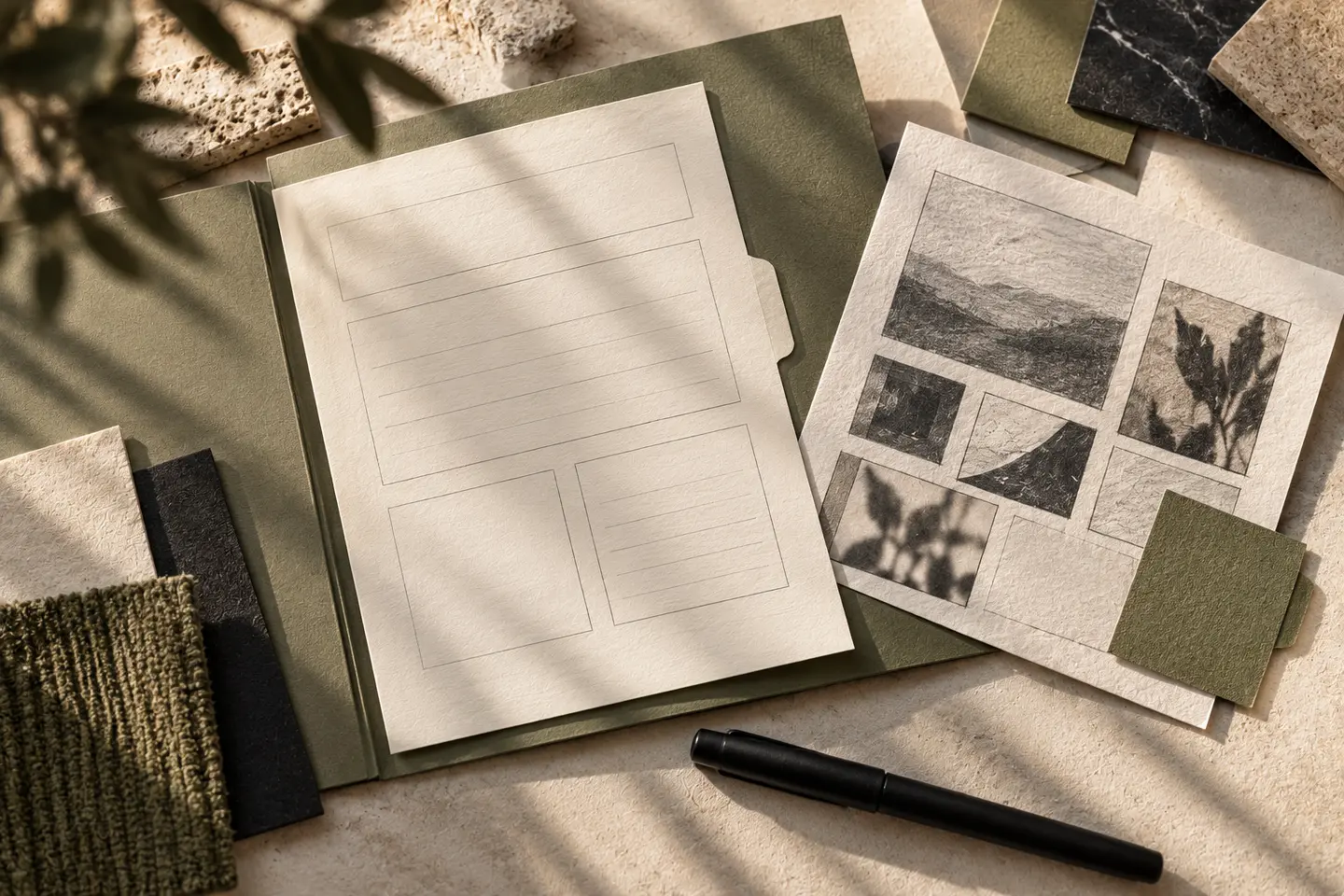
Alongside the master logo, request a range-layout diagram, packaging brand zone and dealer-sheet header where relevant. Distinguish blank templates from completed production artwork. Establish who inserts new product names, who approves technical copy and who checks printer adjustments. If the whole portfolio will not change at once, identify the identity elements shared by old and new packaging during transition. This makes a staged introduction manageable without leaving suppliers to redraw the brand independently.
Key takeaways
- Give company, range and product names distinct visual roles.
- Inspect the identity on actual containers and filled sacks.
- Distinguish product-addition templates from completed packaging artwork.
Frequently asked questions
Does every product range need a different logo?
First examine how the ranges relate to the same company offering. Distinct range headings can often be organised without creating separate company identities. Evaluate that choice through a portfolio example.
Is technical information part of the logo commission?
Client-approved information can enter the layout. Writing, checking and adapting technical copy should be specified separately in the quotation because those tasks differ from drawing the identity.
Which package should be proofed first?
Choose the actual format offering the least usable branding space. Comparing its small-container label with the appearance of a filled sack reveals more than an isolated flat mockup.