In this article
A favicon represents a website in small spaces such as browser tabs. Squeezing an entire long wordmark into a square may create an indistinct patch rather than recognition. Preparing one therefore means developing a small-use version related to the identity, not arbitrarily cutting the main logo. This guide separates visual simplification, file preparation and expectations about its appearance in search results.
Quick answer
Prioritise a square canvas, restrained detail and a recognisable form. Preserve a relationship with the main identity and test at actual small sizes. Declare an appropriate icon file on the site and keep it accessible. Appearance in Google results is not automatic or immediate: eligibility, crawling and Google’s display decisions are separate from simply uploading the artwork.
Choose what to retain from the main logo
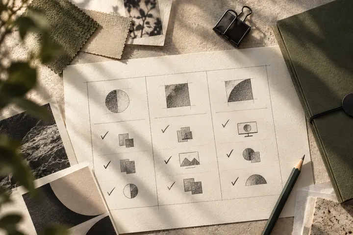
A standalone symbol may provide a starting point. A wordmark-only identity might use a distinctive letter or a short monogram. The result should not become an unrelated brand. A characteristic cut, corner or internal space may preserve recognition. Slogans and descriptive lines usually introduce too much detail for this purpose. Document what has been retained and why other elements were omitted.
Allow breathing room within the square
Filling every part of the square does not guarantee visibility. Space around the mark helps distinguish it from neighbouring interface elements. Fine strokes and narrow openings can disappear during reduction. Compare actual tab-size previews on light and dark surfaces instead of judging only a large mockup. Consider visual centring as well as numeric alignment; a mathematically centred shape can still appear uneven.
Prepare files after resolving the visual design
Keep editable master artwork and create the required pixel versions from it. Google’s documentation addresses square icons, accessible files and stable URLs; consult the current official guidance for recommended size and supported formats. Device needs may require additional files. Choose ICO, PNG or other outputs in relation to the implementation. Renaming an extension does not create valid icon content or a clean small-size result.
Check consistency across the site
Check the icon declaration on the homepage, blog, services and projects. Google treats the hostname as the site for this feature, so individual posts should not be expected to receive independent search favicons. A shared brand icon is a consistent starting point across the same site. Its file must remain accessible and the declaration must reference the intended location. Browser caching and search-engine recrawling are different processes.
Evaluate the result with realistic expectations
A correct browser tab is useful evidence of design and setup, but not a promise of immediate Google display. Official guidance says appearance is not guaranteed even when requirements are met. Establish the correct file and address instead of replacing the icon repeatedly. Record transitions during a hypothetical brand launch. When discussing small-use artwork with BOCW, define favicons, profile images and other digital applications as related but distinct deliveries.
Key takeaways
- Simplify the form for small spaces.
- Check files and declarations across page types.
- Do not promise immediate Google display.
Frequently asked questions
Does each blog post need a different favicon?
A shared brand icon is an appropriate approach for one site. Google’s organic-search favicon is different from an article cover. Treat a post-specific image and a site icon as separate assets.
Why is the icon missing from search after upload?
Check access, declarations and crawl status. Processing can take time and display is not guaranteed. An absent search icon alone does not establish that the artwork itself is defective.
Is shrinking the main logo enough?
It may work for a short, simple mark, while long lettering and fine detail can need a simplified version. Decide using the actual small-size application rather than a large preview.