In this article
The first task of a dental clinic identity is to make the clinic's name recognisable and help visitors reach the right place. Entrance signs, floor directions, appointment cards and the website should carry the same name. A tooth shape or blue palette alone does not establish that system. The brief should define the approved clinic name, intended applications and content responsibilities. Identity design provides no evidence of healthcare quality; the discussion here concerns visual use and institutional communication.
Quick answer
Design a dental clinic logo around clear name recognition and everyday communication. Test signs, appointment cards, digital headers and staff applications together. Neither a tooth symbol nor a particular colour is mandatory; legibility and consistency provide more practical criteria. The clinic's responsible team should approve information and promotional content, while the identity should not communicate treatment guarantees or superiority claims.
Follow the visitor's route to the clinic
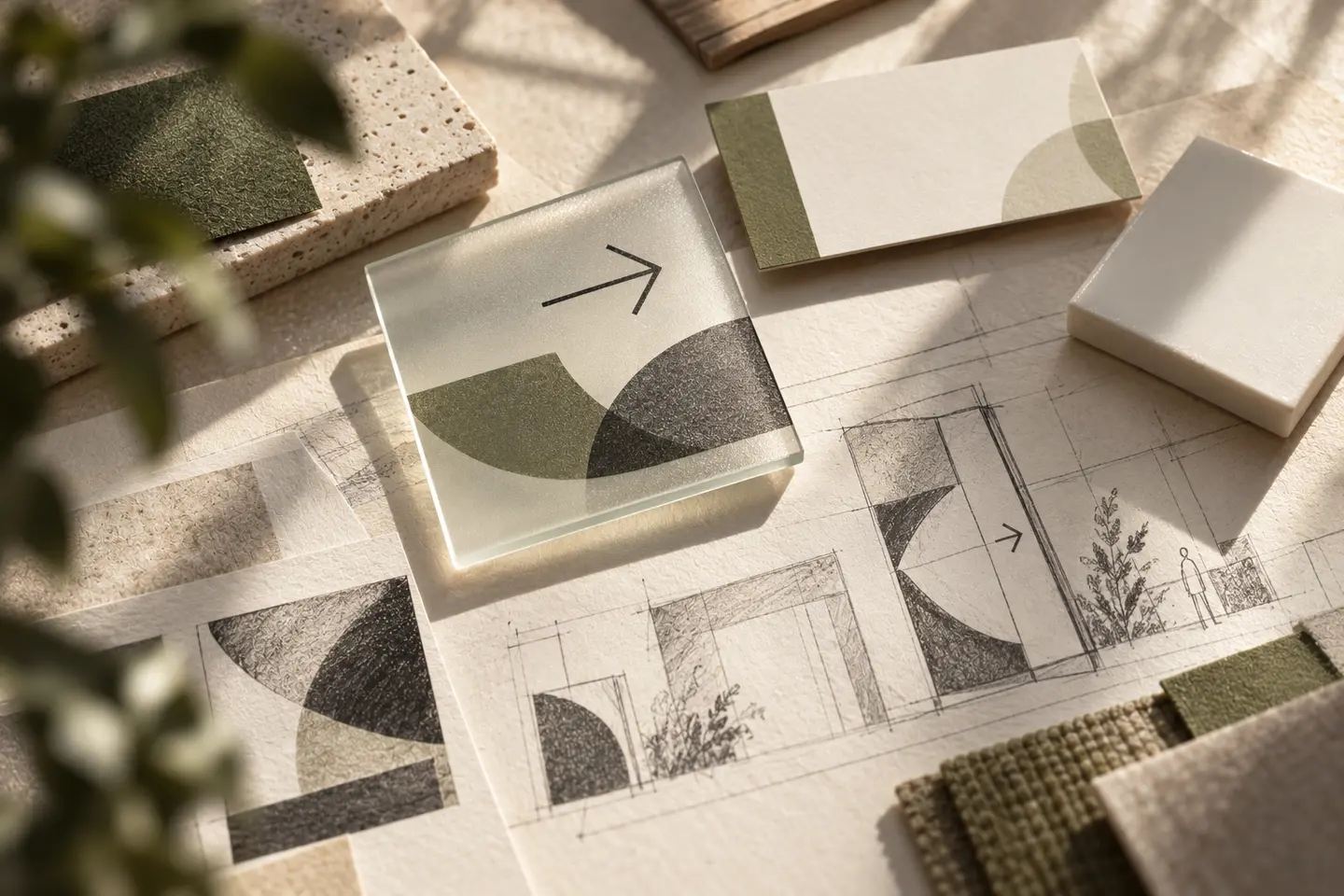
A visitor may first look for the name at the building entrance, then for the correct floor and door. Do not reduce this journey to one large façade logo. Make the same name readable across direction signs rather than expecting a symbol to explain everything. Record entrance, shared-area and internal placements separately in the brief. Photograph existing signs and available spaces. Establish relevant permissions and responsible approvals with the clinic as layouts are developed; visual decisions should account for that process.
Review colour in relation to the space
There is no design rule requiring every dental clinic to share one colour. Assess options beside walls, glass, lighting and printed surfaces. A light colour can sit with darker name lettering; a strong colour may work in limited areas. Compare colours under the actual lighting and on the surfaces used in the clinic. Present light and dark background examples alongside the palette. Make separate legibility decisions for addresses, opening information and directions displayed near the identity rather than judging colours as isolated samples.
The mark identifies the organisation
A tooth shape can suggest the field without explaining every service. Detailed anatomical imagery may become complicated in small applications; a name-led direction can be considered too. Türkiye's Ministry of Health regulation prohibits explicit or hidden advertising in healthcare provision. The clinic's responsible team should consequently assess service descriptions and other content added to the identity. Avoid embedding success, superiority or outcome guarantees in the mark. Use the approved name, professional title and information consistently across applications.
Hypothetical brief: a clinic reached through floor directions
Imagine a clinic on an upper floor. Its brief includes approved name presentation, entrance directions, floor identification, a door application, appointment cards and a website header. Add an embroidery sample if staff clothing is required. The appointment date receives useful writing space; a compact logo does not displace the clinic name. Prepare drafts with fictional visitor details. Identify the approver, producer and person responsible for building applications. This scenario describes neither a real clinic client nor BOCW healthcare outcomes.
Accept the design through finding and reading tasks
Review representative layouts for someone visiting for the first time: can they find the name and floor? Print the appointment card at actual size and fill in its date field. Compare the digital header and mobile information screen. W3C's contrast guidance explains that corporate text outside logos is not exempt simply because of brand colours. Check digital address and direction text separately. Request physical proofs for embroidery or glass applications and match their content with the clinic's latest approved information.
- Confirm the same name at entrance, floor and door placements.
- Check the appointment card with name and date fields in use.
- Assess address and direction text separately on mobile screens.
Deliver what daily communication needs
The package can include usage rules, approved background examples and necessary templates alongside logo artwork. Specify each in the proposal. Signage design, manufacturing, installation and building approval may involve different responsibilities. Define who updates files when appointment or opening information changes. Use healthcare text approved by the clinic rather than allowing the designer to create it independently. This connects the identity to actual information and wayfinding needs and makes the scope more useful than an isolated choice of decoration.
Key takeaways
- Plan the visitor route through entrance, floor and door identification.
- Test the identity separately from address and appointment text.
- State content approval, production and update responsibilities in the scope.
Frequently asked questions
Does a dental clinic logo need a tooth symbol?
No. A name-led or abstract design is also possible. If a symbol is selected, assess its recognition in small applications and its distinction from similar marks. The logo does not need to illustrate every healthcare service offered.
Which colour should the clinic choose?
There is no single sector colour. Compare options through the space, surfaces and text legibility. Do not present colour as evidence of quality or treatment outcomes. Assess it alongside actual applications and the approved information hierarchy.
Are appointment cards and signs included in logo design?
They are included when explicitly listed. Card layouts, signage graphics, physical production and installation may be separate items. Clarify who approves clinic information and who updates files when details change, before agreeing the scope.