In this article
Defence industry logo design starts with making the company's identity clear across corporate settings. A supplier's proposal cover, exhibition stand, staff clothing and website should belong to the same recognisable organisation. The brief becomes more useful when it connects the company name, business description, partnership structure and actual production surfaces. This article concerns visual identity and corporate applications. It does not address product engineering or the design of weapons systems. The aim is a workable identity system that teams can use consistently.
Quick answer
A defence industry logo should carry the company name clearly and work consistently in corporate documents, on physical surfaces and in digital channels. Priorities include legibility, single-colour reproduction, partner arrangements and controlled file distribution. Assess the design through real application examples before approval, and include the production rules for those examples in the delivery scope.
Define what the supplier identity needs to explain
Trying to put every business capability into a logo overloads a small space. A hypothetical supplier offering electronics, software and maintenance may find an identity based on one product silhouette restrictive as its services develop. The brief should distinguish the company name, an optional descriptive line and possible future divisions. Evaluate visual directions against that structure. A symbol should not be presented as evidence of technical competence, certification or official endorsement; those claims require their own verified information.
A proposal cover and a metal plate need different proofs
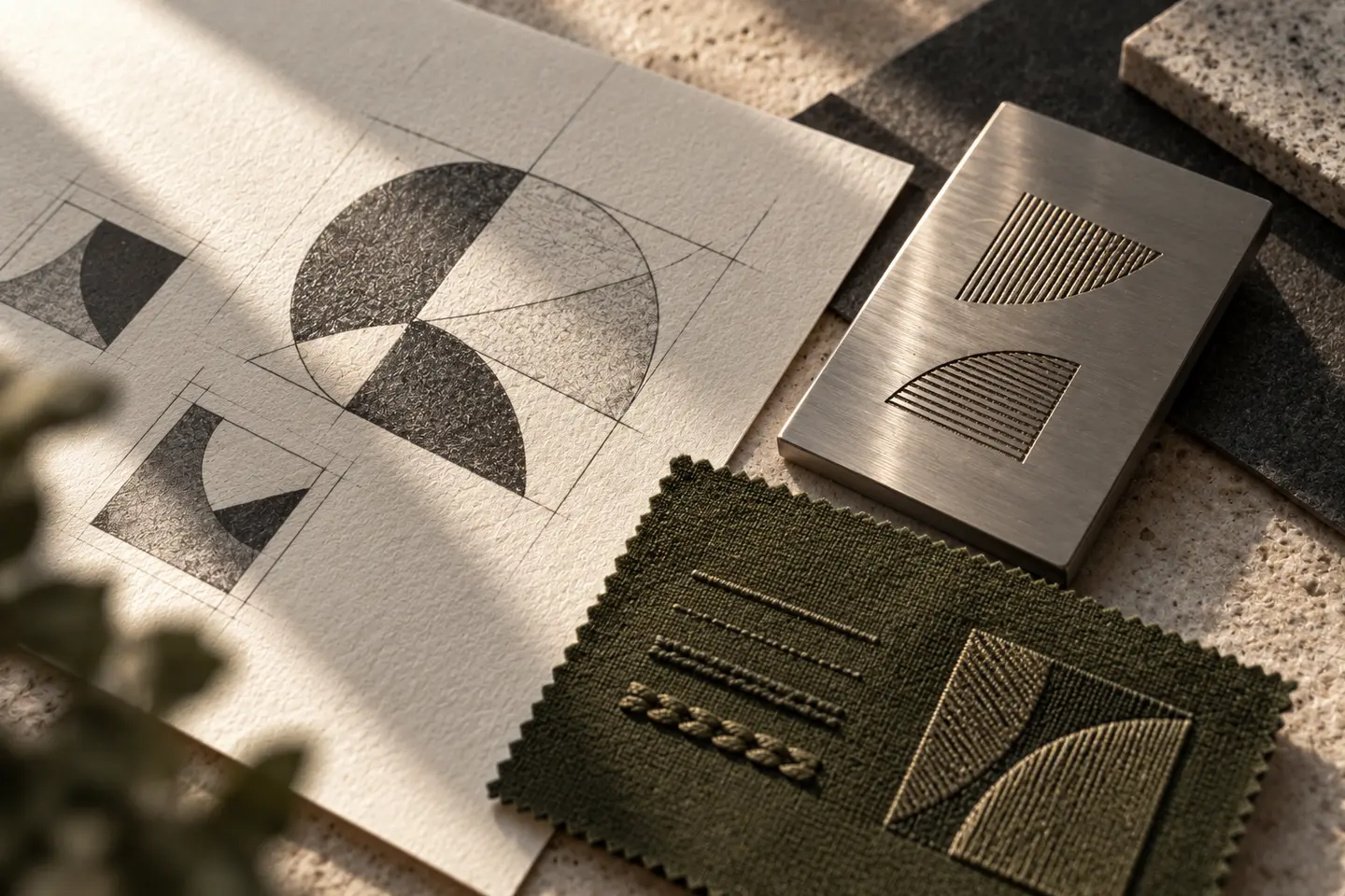
A fine line that looks convincing on a presentation cover may be unsuitable for a small corporate plate. Request separate digital, printed and physical proofs. The main logo, a single-colour version and a narrow-space arrangement can belong to one family. Where engraving, cut vinyl or embroidery is planned, include a manufacturer's sample on the intended material. Rather than inventing a universal minimum size, record the approved dimensions and artwork version for each particular production method and application.
Arrange partner visibility before it becomes urgent
At an exhibition or in a joint corporate announcement, the company identity may sit beside other organisations' marks. Define the lead brand, order, separating space and explanatory line so each presentation does not require a fresh decision. Making every logo the same height may not balance their visual weight; compare actual layouts. Obtain permission and correct artwork from the relevant partners. The identity guidelines should show approved arrangements while respecting each organisation's own rules, rather than attempting to replace them.
Hypothetical brief: a corporate supplier document set
Imagine a business presenting two service divisions under one company name. Its initial scope includes a proposal cover, a catalogue with technical content supplied by the business, visitor cards, embroidered polos and a corporate website header. The brief specifies Turkish and English documents. Division names become editable template fields rather than additions to the logo. A procurement communications representative, brand coordinator and production representative attend the review. This fictional example describes a possible brief, not a BOCW client or completed project.
Approval should demonstrate practical use
A large, full-colour screen presentation is insufficient evidence for approval. Check the company name on a small proposal printout and beside a longer English description. Inspect the embroidered sample for retained internal spaces. Separately assess the website's address and navigation text. W3C's contrast guidance explains that corporate text outside logos is not exempt from contrast requirements because of brand colours. Consequently, deliver the palette together with clear text and background combinations, rather than as isolated colour swatches.
- Compare single-colour output and light/dark background examples.
- Check company names, descriptions and division labels in both languages.
- Approve the physical sample at the intended size and on the intended material.
File control is part of the identity system
Different people may prepare proposals, stand graphics and staff applications. The delivery package should explain which file serves which purpose, including colour values, clear space and approved layouts. Agree how previous artwork will be retired. When comparing quotes, ask about application quantities, physical proof responsibilities, partner branding and later adaptations as well as the logo itself. An explicit scope lets teams prepare new corporate documents from an established system and reduces avoidable variation across the organisation's everyday communication.
Key takeaways
- Define company and division naming before choosing a sector symbol.
- Request separate production proofs for engraving, print and embroidery.
- Document partner arrangements and responsibility for distributing approved files.
Frequently asked questions
Does a defence industry logo need a shield?
No. A shield is an option when it fits the intended identity, not a requirement of the sector. A name-led or abstract approach can also be assessed through corporate applications and the company's particular brief.
Should each service division have its own logo?
Start with how audiences should understand the divisions. Variable division names beneath one company identity may be sufficient. Separate logos add management work; if distinct brands are necessary, design their relationship deliberately.
Which applications should a quote include?
Prioritise recurring proposal covers, catalogues, corporate screens and physical identification. Supply actual dimensions, producers and language needs. Confirm in writing whether exhibition adaptations and embroidery preparation belong to the initial scope or require separate work.